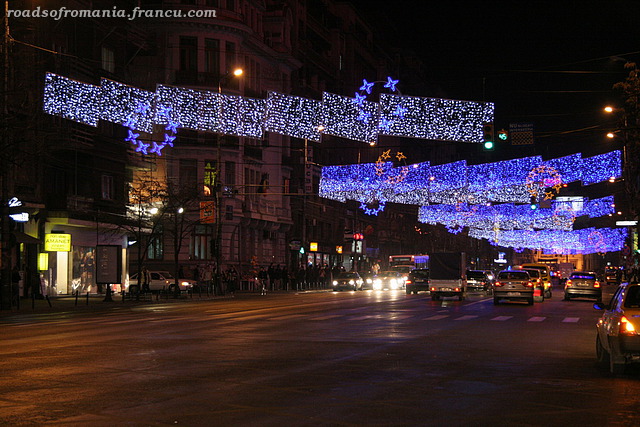
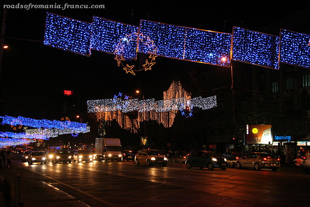
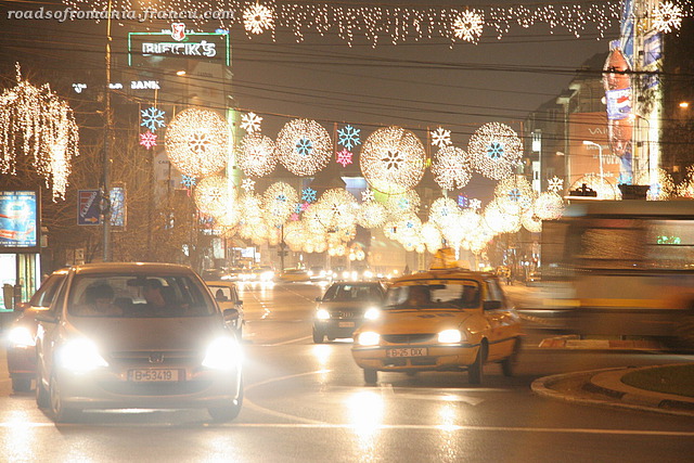
The Christmas decorations in downtown Bucharest come in blue, white and yellow this year. Especially blue. First time I saw them I asked – without giving it much thought – why did they use blue? Christmas is supposed to be red and green. Last year the lights were mostly white and two years ago they were also white and blue. Is the city hall fixated on white and blue? My brother told me the lights are celebrating Romania’s entry into EU which will take place January 1, 2007. Duh. This year they have a reason for the blue 🙂 Afterwards I noticed that the decorations lining Magheru Boulevard, between Universitate Square and Romană Square, even display a round circle made of stars that has been the mark of the EU for so many years.
Yes, it’s true. Romania will join the EU starting January 1, 2007. It’s not my place to say if we’re ready for this step or not. Others have done it for me and the subject has been debated in great detail. From my part I hope that joining the EU will bring more political stability for my country, the pressure to accelerate the reforms, a raise in foreign investments and hopefully some curbing of the corruption that has engulfed Romania since the fall of the communism in 1989. I realize that these are all long term goals and that we might not see any changes for many years other than an increase in the freedom to travel and maybe an easiness in doing commerce. I guess the end goal – aside from political stability which to me will be the greatest achievement – will be economic growth for Romania and with it a raise in the standard of living of the population.
This year’s decoration
